Concepts
App Navigation Reinvented
Problem
Phones have grown significantly, making the top-left back action inconvenient. Additionally, apps like Instagram and TikTok often overlay information on content, increasing cognitive load and reducing the impact of both content and ads.
Solution
A minimalistic navigation system built around gestures, featuring primary, secondary, and tertiary submenus. It brings navigation closer to the user’s fingers for a more comfortable touch experience. The icon is positioned in the bottom right by default but can be adjusted to the bottom left for left-handed users.
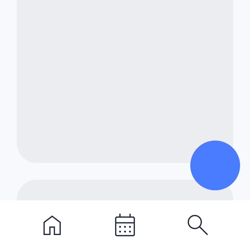
An icon continuously hovers in the bottom-right corner. A quick flick up is ignored to ensure it doesn’t interfere with normal scrolling.
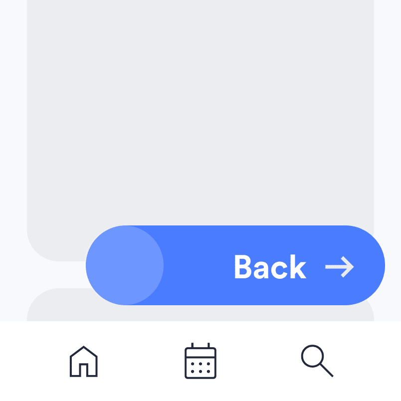
Slide left on the icon to trigger preparation for a back action, then flick right to return to the previous page. This eliminates the need for the top-left back button or flicking from the phone’s very edge.
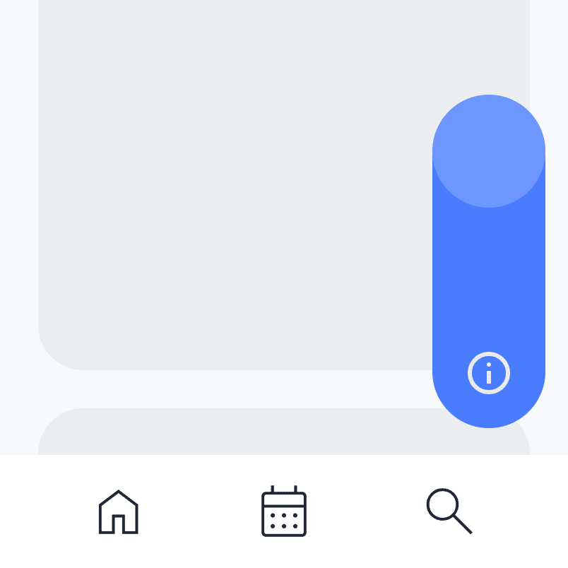
Hold and flick up to reveal information, ideal for tertiary details or actions.
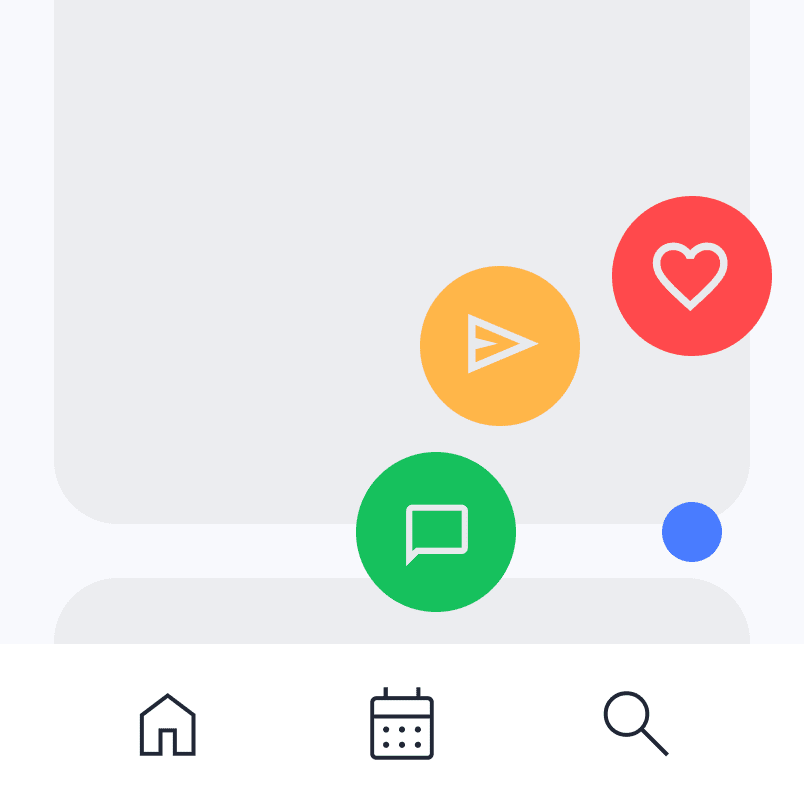
A long press opens a submenu with secondary options like “Like,” “Share,” and “Comment” etc. The user swipes to an icon, releases, and the action is instantly triggered.
This idea is entirely conceptual and has not yet been realized in any form. A prototype is in development, with further fine-tuning and implementation of ideas underway.
Catalyst - A Simpler Framework
Problem
Existing frameworks rely on a rigid 12-column grid, making them restrictive and requiring significant learning and effort for developers. Also, the more code they add, the higher the risk of bugs. While the frameworks aim to speed up development, they’re often not fast or stable enough.
Solution
A user-friendly framework with quick utility classes and an adaptive grid system that adjusts content automatically. Its lightweight design and efficient code structure minimize the need for custom CSS overrides.
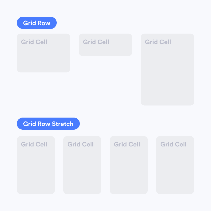
A grid system where column widths are determined by the number of elements inside the container, eliminating the need to specify column counts. It adjusts automatically for responsiveness.
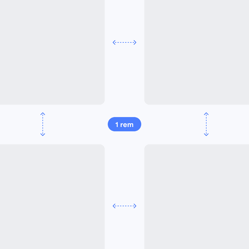
Margins and paddings use the rem standard, aligning with the default font size to ensure perfectly symmetrical spacing.

Naming conventions are based on Emmet for familiarity, ensuring developers can rely on a recognizable system without needing to learn something entirely new.
This site uses a customized version of this framework, which is already implemented on several company websites and is currently being tested and fine-tuned in real-world applications.