For a story to resonate, it must tap into something essential: the desire to thrive. In a world overflowing with distractions, clarity is what makes an impact. Whether it’s a crisp UI, seamless UX, a compelling brand identity, or an effective marketing strategy, I specialize in creating experiences that stand out and connect. Every element — from design to storytelling to marketing — works together to build a brand that captivates, inspires trust, and drives results.


Problem
To establish a noticeable presence in the trucking industry, the Lanefinder brand needed to stand out, convey an appealing attitude to attract its target audience, and communicate a unique identity that differentiates it from competitors.
Solution
I analyzed the competition and decided to adopt a more feminine color scheme to differentiate my work. The colors were carefully selected and applied to evoke the feel of traditional American road signage in it's usage, creating a familiar yet distinct visual experience for the target audience.
Outcome
The response was overwhelming – within just a year, Lanefinder became a trusted and distinct resource, with truck driver schools regularly recommending it as a reliable job board with a unique touch.
Problem
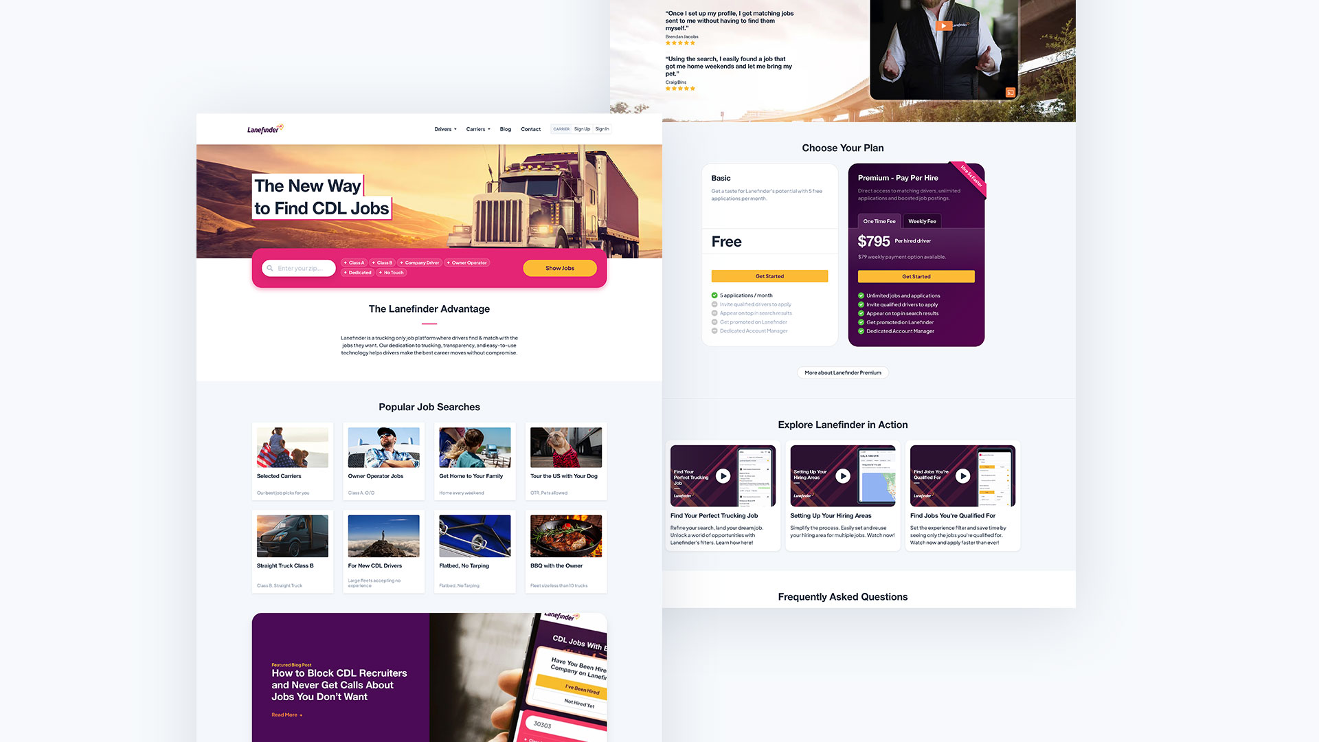
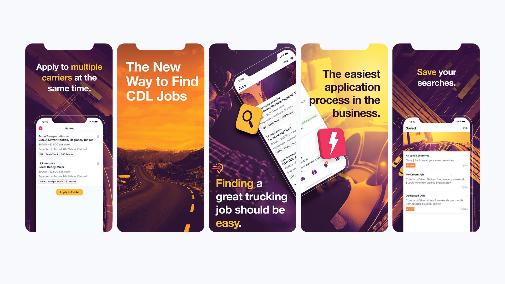
The website acted as the main advertising platform and included uniquely designed landing pages. It was essential in helping users start their job search and connect with our services.
Purpose
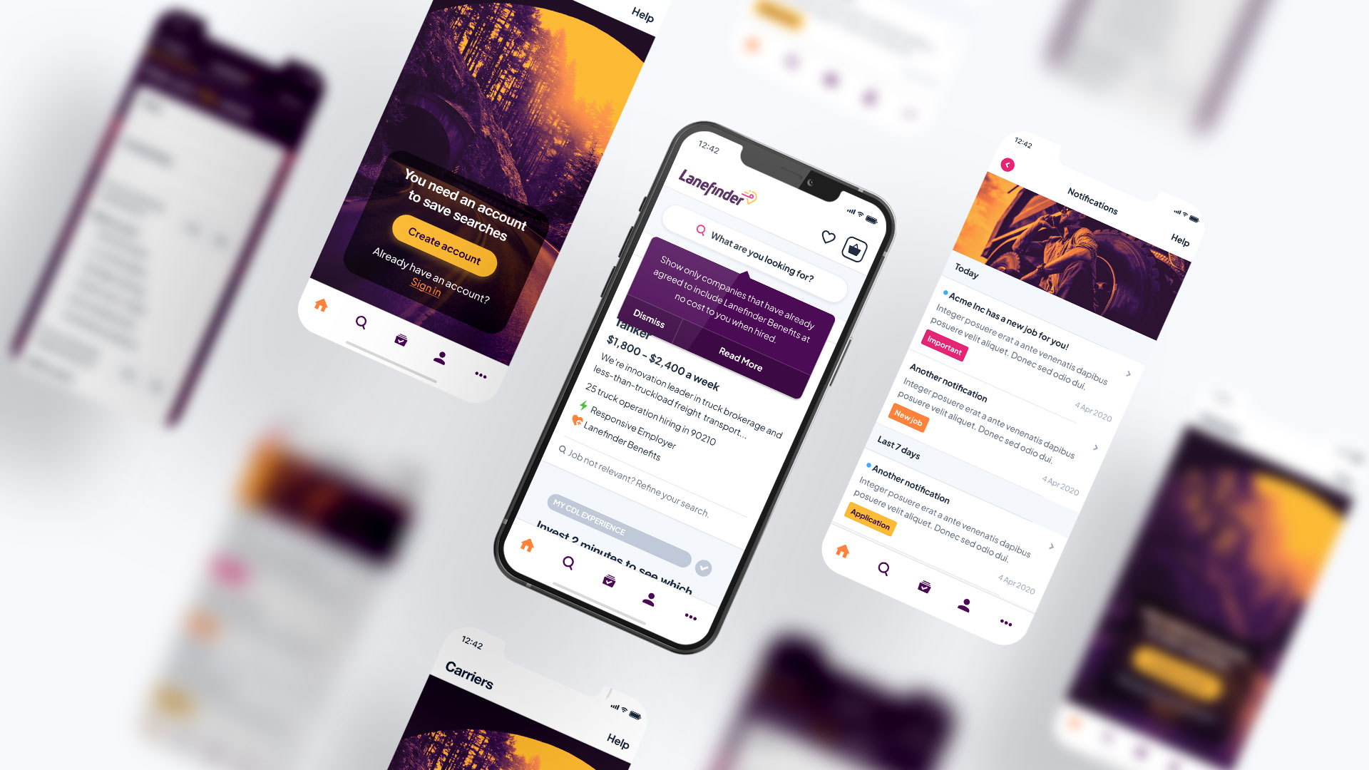
The aim was to guide drivers into our app to improve user retention and offer features that benefit both Lanefinder and users, particularly through notifications to keep users engaged. This engagement would not have been possible if the platform existed only on the web, as mobile apps provide unique opportunities for retention and user interaction.
Solution
I positioned the account registration step at the end of the application process to leverage the user's commitment. We also sent follow-up emails and messages to encourage users to download the app, emphasizing benefits like increased visibility of their applications to employers.
Problem
In the trucking industry, drivers need to find specific jobs due to strict regulations, making it challenging for job search platforms to offer enough value to become the go-to option.
Solution
I tackled this by incorporating detailed filters into the design, helping drivers avoid wasting time on jobs they weren't qualified for due to regulations. The app also kept them updated on their application's progress and gently guided them to take actions that benefited both them and us.

Problem
Most communication with drivers occurred through the app, Lanefinder's main platform. The challenge was that the trucking industry requires a detailed application with hundreds of fields, which can be tedious, especially for a new job board. Building trust takes time, and this complexity can hinder user engagement.
Solution
I tackled this challenge by simplifying the application process into a pre-qualification stage. Once a driver received interest from a company, Lanefinder sent automated emails and notifications prompting them to complete their profile. It's like playing poker - asking for just enough information upfront to build commitment, while subtly guiding users toward the next step.
The trucking recruitment industry is uniquely complicated, heavily influenced by insurance and regulatory requirements. Unlike other industries, I had to learn its ins and outs thoroughly, consolidating a maze of hundreds of screens and workflows. This meant designing a system that didn’t just assess eligibility but also ranked candidates as eligible, a good fit, or a great fit based on algorithmic logic. It was a massive and fun challenge.
Ultimately, this method provided companies with key driver information upfront while ensuring they eventually received complete profiles that met DOT and insurance requirements.
Outcome
My strategy significantly increased job applications, growing from just a few to thousands each month. In addition, both surveys Lanefinder conducted showed genuine appreciation for its design and user-friendly flow.

Problem
A clear brand identity was essential for quickly connecting jobs to our clients and making a significant impact on our target market to build a regular customer base. Additionally, time was critical; we needed to disrupt the stagnant practices that have long characterized the trucking industry.
Establishing a strong brand not only helps differentiate us from competitors but also builds trust and recognition among potential customers, which is vital for fostering loyalty and driving business growth in this competitive landscape.
Solution
To address the challenge of developing a clear message that stood out among the competition and supported Lanefinder's Unique Selling Proposition, I crafted a distinctive message that effectively communicated the brand's value to truckers.
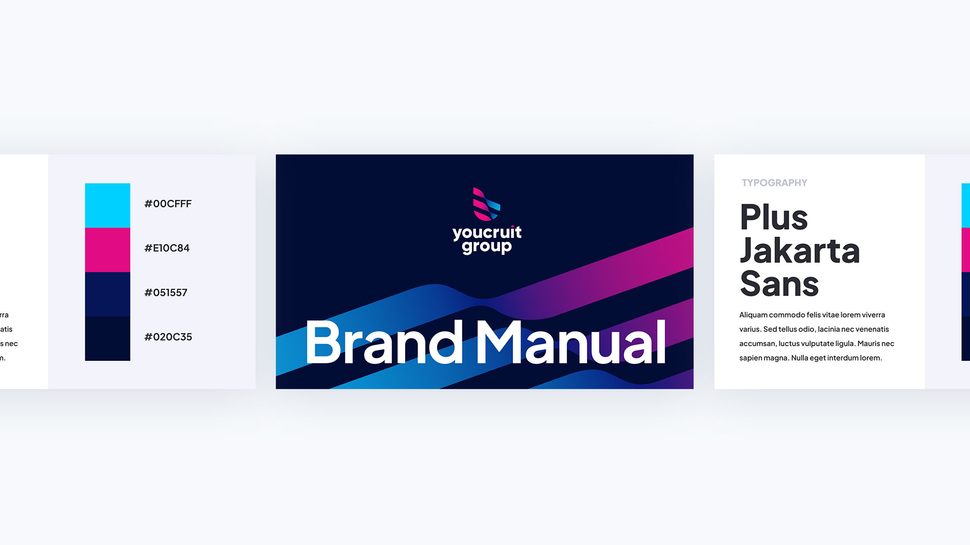
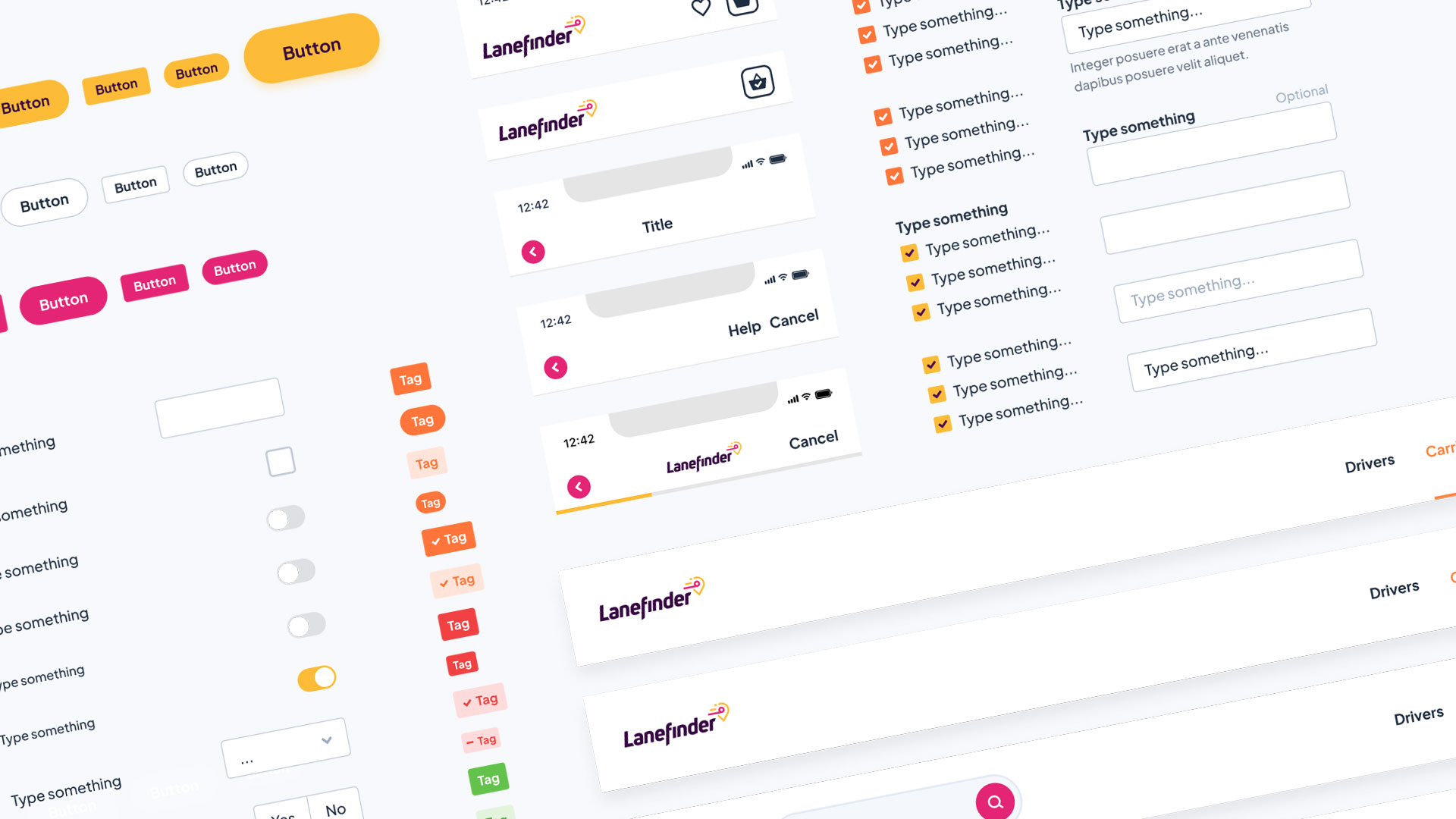
Additionally, I established marketing asset libraries in Figma for both marketing and development, ensuring brand consistency across all media and platforms. This approach not only made it easy for truckers to instantly recognize Lanefinder's communications but also streamlined the development process, allowing teams to work more efficiently while reinforcing a cohesive brand identity.


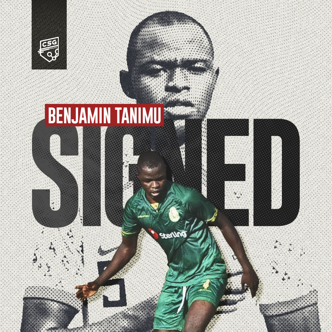
When I joined the company, the logo was already in place. However, since the brand was focused on being fun and playful, I developed various materials to highlight this aspect, including post-processing and motion graphics.
In addition, recognizing the need for an enhanced brand identity, I created and introduced Geophrey, a robot character that represents the underlying artificial intelligence of the system. He has appeared in explainer videos, animated iconography, and other creative productions. By dressing Geophrey in different outfits, he aligns with any concept or idea, and further reinforcing the YouCruit brand.
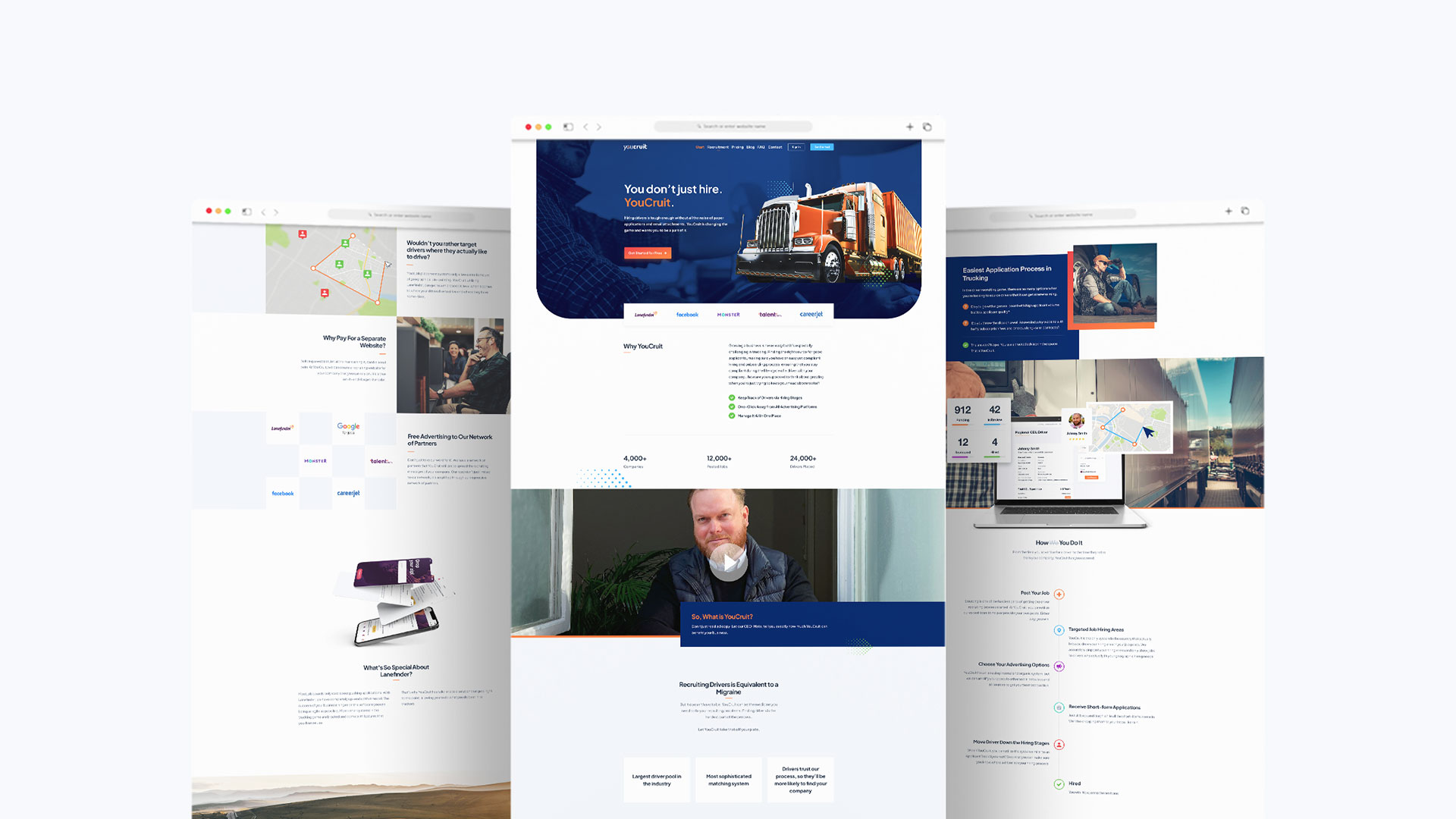
After a few years, the original branding for YouCruit appeared too playful and did not resonate with the target audience as the company shifted its focus to the US trucking industry. To address this, I modernized the design to better reflect the functionality and strength of the Applicant Tracking System.
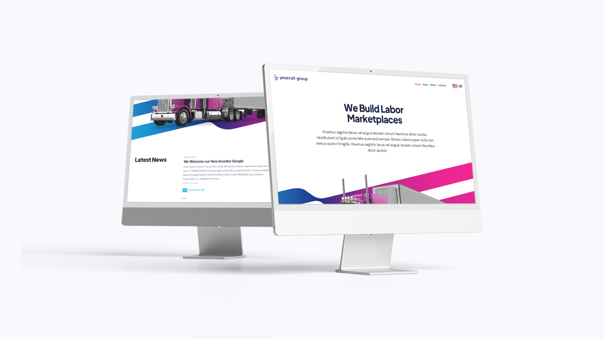
The website was designed to serve as an informative resource for potential customers, providing them with clear calls to action to sign up for our services.